


The visual language of Stüssy.
How the font they designed 30 years ago is still paying dividends.

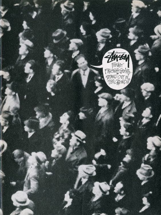
Blue Ocean Strategy, The Purple Cow, ZAG by Marty Neiwmeimer and almost every brand strategy book will tell you that when the industry goes one way, you must go the other. You need to stand out to not only be successful but also to be like Nas and Survive The Times.
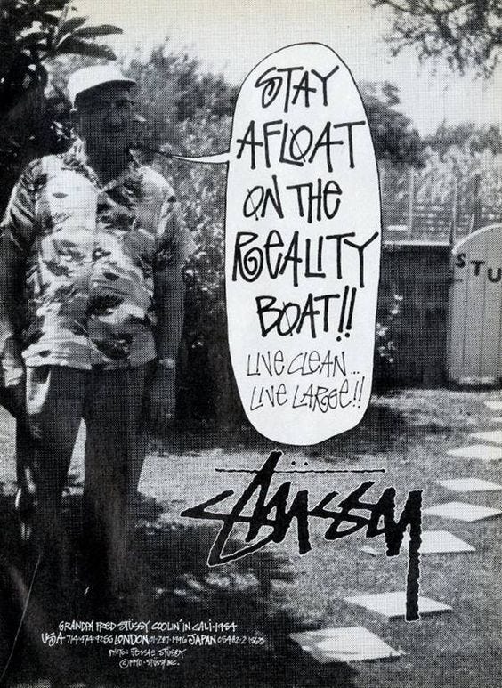
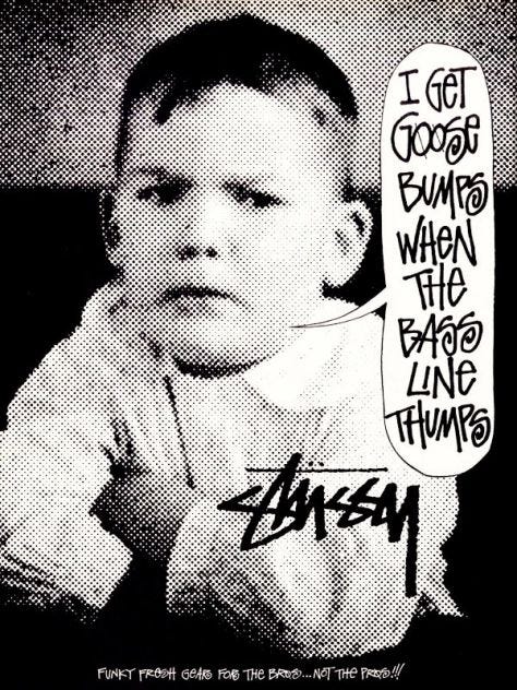
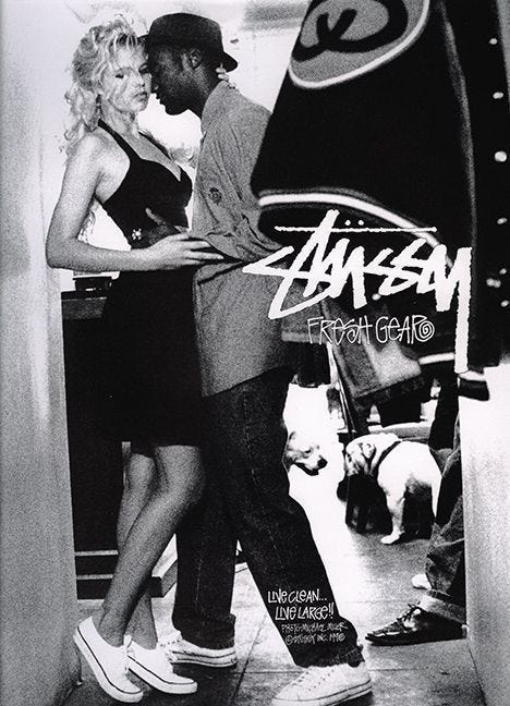
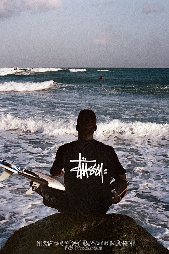
Stüssy's visual identity, born as a signature for his custom surfboards in the early 80s, remains iconic four decades later. It's a rebellious emblem, a product of punk rock's influence and the defiant culture it embodies, a brand that defied fashion norms and created its own genre, streetwear.
The look and feel of Stüssy has evolved over the years, but for the most part, what you see today is what we saw in the early print advertisements in the early 90s, during the 'birth of streetwear'. Stüssy's use of typography has always been a point of difference, and it's helped the brand become one of the most recognisable brands in the world.
I'm sure I'm not the only graphic designer to have googled' What is the Stüssy font? ' many times throughout my career.
Here is a look at Stüssy's use of typography in their visual language:


As always, I appreciate your time. Thanks for reading.