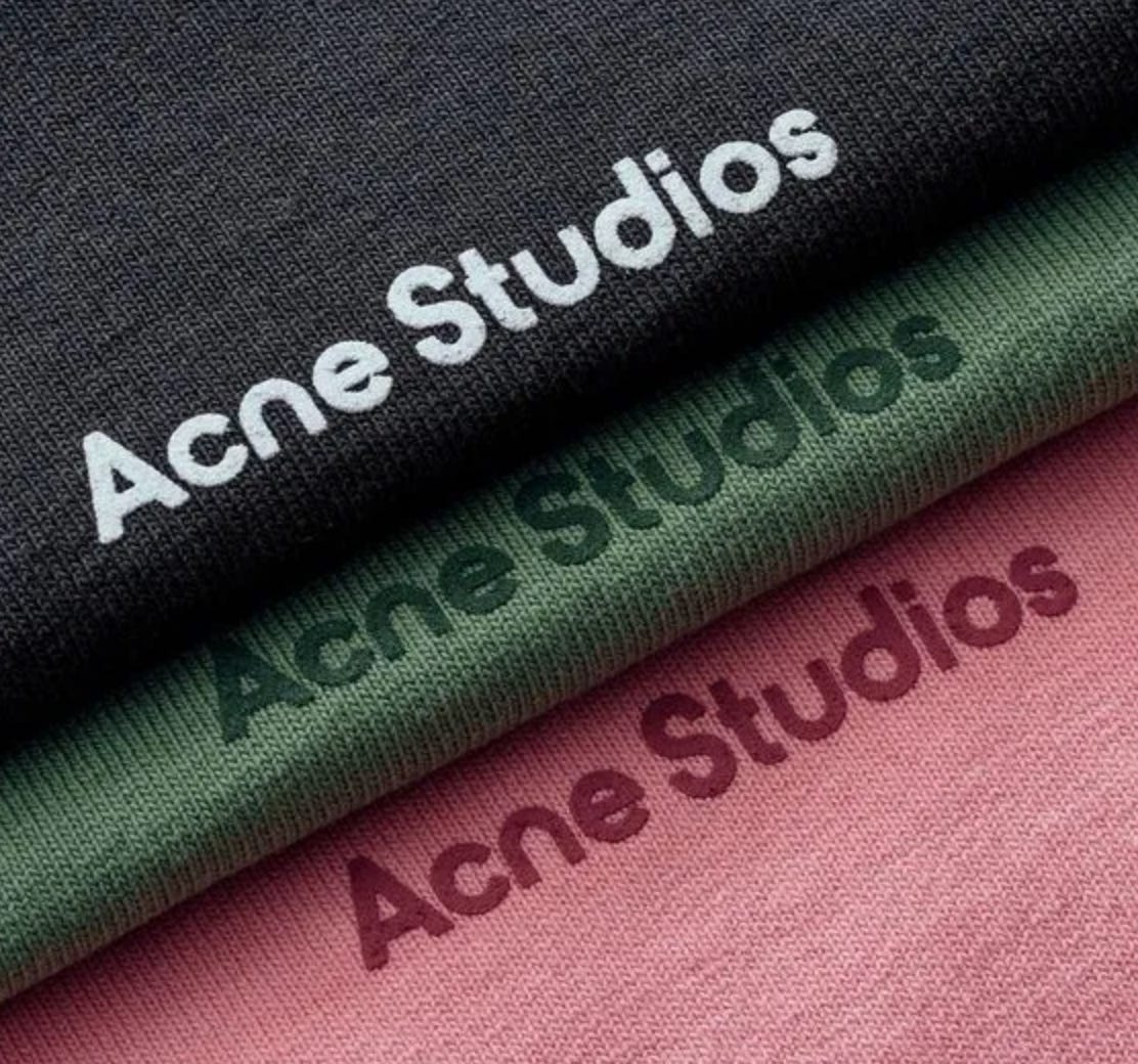
Brand Focus - Acne Studios
A creative agency from Sweden turned contemporary fashion powerhouse.
What started out as a way to promote their creative agency has turned into your favourite creative’s favourite brand. A brand that has mastered the art of what I call ‘playful premium’ - Showing expression and personality while maintaining an aspirational positioning. A brand that has created a world of its own through its focus on branding and its commitment to innovation and forward-thinking.
Yes, this is not a streetwear brand but from a consumer’s perspective, I’ve been lost in the middle of the menswear and streetwear space for the last few years so here we are. I don’t fuck with the hype streetwear products and I don’t like the boring menswear that is for finance bros. I love brands that play in the middle. Scrappy, with the attitude of a streetwear brand and the quality of a premium menswear brand. Acne studios is the sweet spot for me - I’m sure their founders would hate this.
Acne started off as a graphic design and advertising agency but decided in 1996 to enter the fashion game starting with denim. Acne’s plan was simple. Make a standard pair of 5-pocket jeans, according to creative director Jonny Johansson, “the coke-cola of fashion”, and use these jeans as a way to promote the agency. No thrills or anything fancy, just subtle detailing (red stitching) with a focus on quality. The first 100 pairs were given out to friends, family and photographers - safe to say, the initial €10,000 investment was a good one. The initial promo items were so good that Acne left people wanting more. So Acne Studios was born to meet the increased demand for fashion products.
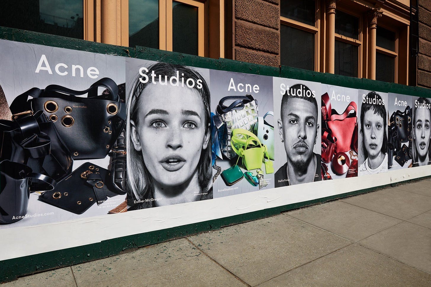
Initially pigeonholed as a denim brand, the brand kept pushing forward, determined to be seen as more than a denim brand. They focused on their strength, their branding. From 1996 Acne Studios has continued to set itself apart through its creativity and more specifically its branding. For a premium brand (sitting below luxury and above mass market), Acne’s attention to detail (both manufacturing and design) has helped justify its pricing and create a cohesive brand identity. The Acne aesthetic is instantly recognisable and characterized by a bold and minimalist aesthetic, which is built around a unique blend of contemporary design elements, experimental art direction, and innovative branding.
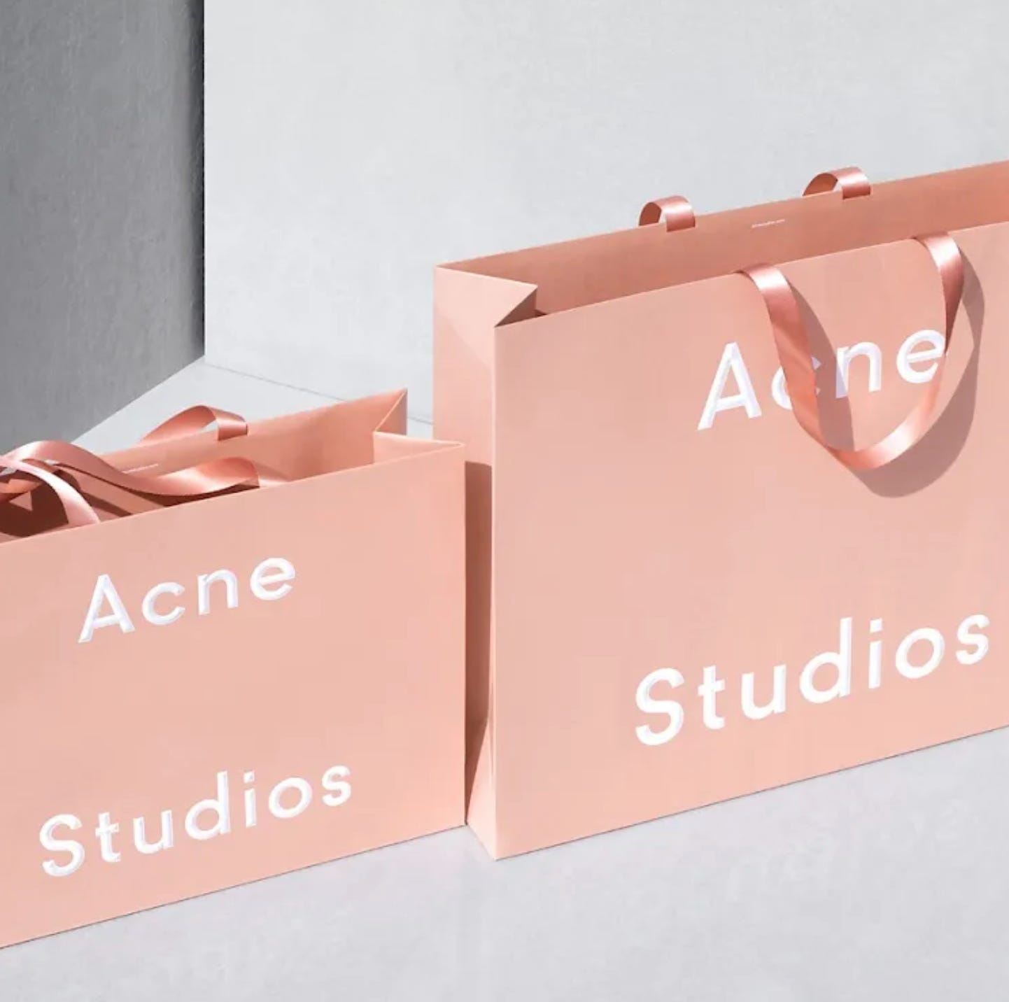
Staying true to the name, "Ambition to Create Novel Expressions", reflects the brand's commitment to innovative, forward-thinking design. There is no surprise that a group of graphic designers entering the fashion world focussed on branding to be their point of difference. The pale pink which has not only come to be a representation of Acne Studios but also synonyms with Sweden itself - was used by Johannson because the common perception of pale pink was that ‘it’s an ugly colour’. When your competitors are zigging with black and white shopping bags, you do the unthinkable, choose an ‘ugly’ colour to zag.
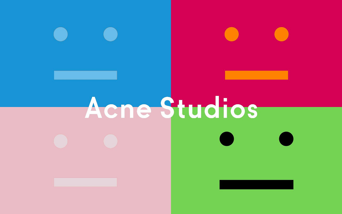
The Acne studios Face motif. You might think it’s strange for a design agency to have a logo that looks like it was a deadpan reaction on an MSN chatroom and tbh I agree. Whilst I try to avoid their products that feature it, it definitely has stood the test of time, with the brand’s most recent collection featuring it more than ever. Johannson recently explained to Highsnobiety how this all came about: "We were doing a fitting for a show and we didn’t have a bag—you always have to have a bag when you do a show. So I took a piece of paper and I drew this Swedish guy. Instead of a smiley, I drew a square face from a straight line and two dots for eyes. And that’s how it came to be, just an ordinary Swedish citizen. Not too happy, not too sad, but somewhere in between. Lagom in Swedish. Since then he appeared on other things and became bigger and bigger in the collections, and rather than let it get out of hand, I thought he has to officially belong in the Acne family; I started thinking about what family means to me, and what is important within families."
Fun Fact for you: Cofounder Tomas Skoging told Highsnobiety that Acne originally stood for ‘Associated Computer Nerd Enterprises’ at first. Creative director, Johansson has often admitted that he still doesn’t like the name, Ambition to Create Novel Expressions.
Acne Studios has managed to establish itself as a brand with a distinct and unparalleled creative vision in the competitive world of the pointy end of fashion. Their approach to design is difficult to define, yet it has led them to become a contemporary brand that exudes a unique, cool aesthetic. "Pure luxury you can wear every day" is how Acne Studios has been described, and this perfectly encapsulates their ability to strike a balance between the high-end and accessible, wearable fashion.
As always there is a Brand learning:
- Focus on your brand. “Our product is what separates us” - whilst I agree with this in theory, I have to ask ‘what happens when fast fashion houses and other brands start copying your product’? Using the best quality product as a brand positioning is an extremely tough way to win. To successfully position yourself here, you need to be spending thousands of dollars on product innovation and development. The 210gsm cotton t-shirt you’ve been using for 3 years, is the technology that is 3 years old.
- Separate yourself from your competition. Don’t be another version of the competition. This includes ripping off the Aime Leon art direction, shot in an aspirational apartment with nostalgic sports memorabilia on the walls. It’s been done to death. Know who you are and do whatever it takes to stay true to who you are whilst standing out.
Thanks for reading.


